In response to eatmore excellent blog post on the design flaws of Google's new Code Jam site, my brother and I created a simple UserScript to fix the recent UI changes.
You can use install it via Greasemonkey, Tampermonky, etc. with this link, or if you prefer, directly via the code from here.
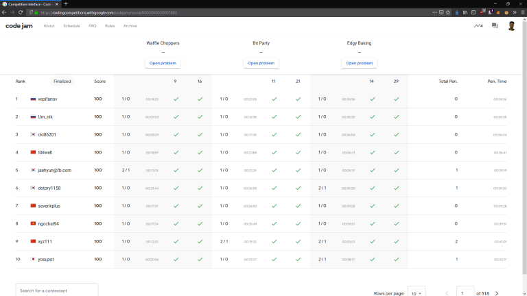
- Removed the useless graphs from the leaderboard.
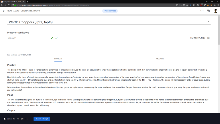
- Removed the editor from the problem page, and moved the submit button to the bottom.
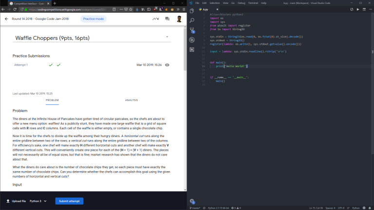
Due to the fact that the page was designed to hold only half the question in the first place, split screening with a custom editor actually looks quite nice. I've attached some pictures below.


This is still a work in progress, and there might be some bugs, please feel free to send your feedback.


