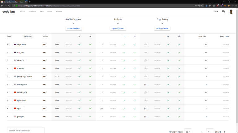
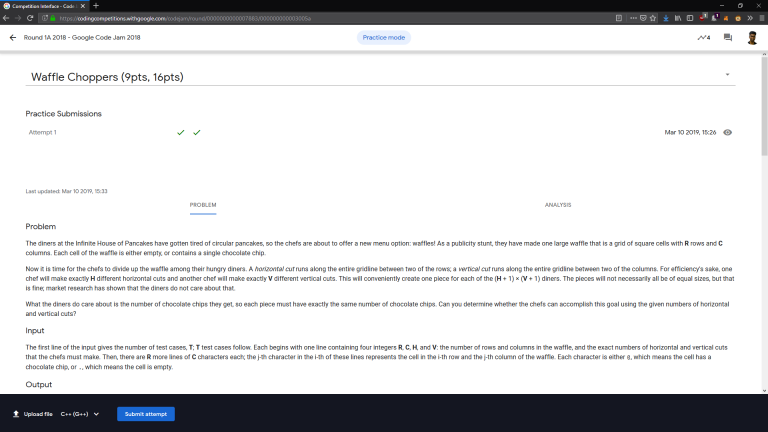
In response to eatmore excellent blog post on the design flaws of Google's new Code Jam site, my brother and I created a simple UserScript to fix the recent UI changes.
You can use install it via Greasemonkey, Tampermonky, etc. with this link, or if you prefer, directly via the code from here.
- Removed the useless graphs from the leaderboard.
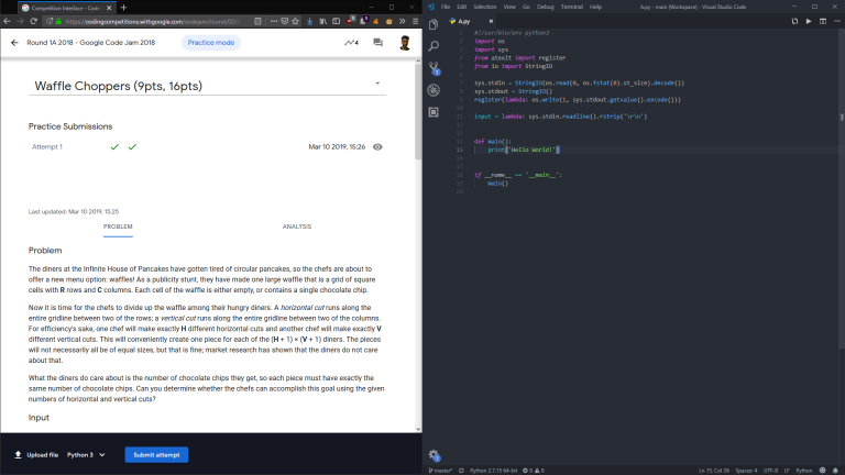
- Removed the editor from the problem page, and moved the submit button to the bottom.
Due to the fact that the page was designed to hold only half the question in the first place, split screening with a custom editor actually looks quite nice. I've attached some pictures below.


This is still a work in progress, and there might be some bugs, please feel free to send your feedback.


This looks great!
Now that you have removed the graph, I think it'll be a nice feature to have something like
correct/total submissionsat bottom row for each task, like in codeforces scoreboard, if it can be done.Working on this right now actually, so that we have something similar to the old Code Jam interface, ideally one-click to navigate between problems and the data from the graphs (the submit ratio) in a sidebar.
how to view submissions and solutions . i xant view them
The site you linked doesn't seem to have a scoreboard in the first place. https://codingcompetitions.withgoogle.com/kickstart/round/0000000000050ee2
Moreover, made this only with Code Jam in mind and didn't do comprehensive testing of everything else yet, so you can just disable the script otherwise for say Kickstart if you have issues.