| # | User | Rating |
|---|---|---|
| 1 | tourist | 3856 |
| 2 | jiangly | 3747 |
| 3 | orzdevinwang | 3706 |
| 4 | jqdai0815 | 3682 |
| 5 | ksun48 | 3591 |
| 6 | gamegame | 3477 |
| 7 | Benq | 3468 |
| 8 | Radewoosh | 3462 |
| 9 | ecnerwala | 3451 |
| 10 | heuristica | 3431 |
| # | User | Contrib. |
|---|---|---|
| 1 | cry | 167 |
| 2 | -is-this-fft- | 162 |
| 3 | Dominater069 | 160 |
| 4 | Um_nik | 158 |
| 5 | atcoder_official | 156 |
| 6 | adamant | 152 |
| 6 | djm03178 | 152 |
| 8 | Qingyu | 151 |
| 9 | luogu_official | 149 |
| 10 | awoo | 147 |
Hello!
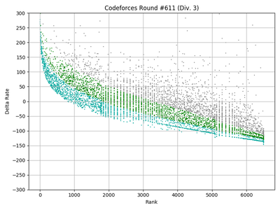
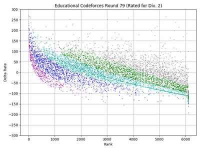
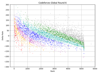
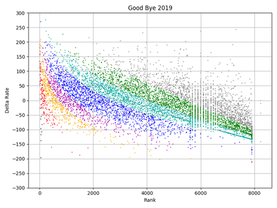
I recently learned about the Codeforces API and tried to code some to see what is going on. I found that the distribution of rating changes in every contest is almost normal (of course). Then I plotted the rating changes by their rank in some recent contests and saw these beautiful harmonies, and I think it is worth to share!


(Color of each dot shows the color of each handle before the contest.)
But there are somethings strange to me. First, why does the cyan area has a thick line in the middle? (Can you see it?) For the first time, I thought it happened because of new registrants users in Codeforces. But I saw it in 10 recent rated contests.
Second, can someone determine the goodness of a contest by these plots? Or they don't have any relations?
You can find code in this link to test and play yourself.
update: Thanks to Adhami. There were some bugs in the code. I edited the code and charts.
| Name |
|---|


