First note: All observations are from my computer screen with the resolution of 1366 × 768. OS is Windows 10, browsing Codeforces using Google Chrome and coding using Code::Blocks 17.12. People with high-end computers/monitors or different software usages might experience differently or less inconvenient, yet the problem itself is still there.
TL;DR: The source codes presented through the "block code" format in Codeforces blog post should be made slightly smaller in terms of font size, and with less line spacing. A suggestion might be making it similar to the source code presented in the submission pages.
Many problem setters prefer showcasing model solutions on spoilers and direct sourcecode-formatting on blog posts (most notable ones are PikMike and Vovuh). I myself particularly enjoy this design, since the source code is collapsible and you won't lose the editorial tab you're watching (clicking any external links normally will not open it in a new tab, so sometimes it'd be annoying). However, the way the source codes are formatted seems to discourage some people (including me) from reading it.
I know reading source codes should be the last resort, if the editorial texts failed to explain things to you or the implementation intended in some parts was too complex that words couldn't make it. However, there has to be some times for some people to rely on this feature, and if that time comes, it should be made right.
Let's take the editorial blog post of Codeforces Round #515 for example.
Our target is problem D's solution by Vovuh.
Let's assume that I'm a newcomer intending to read the model solution. And this should be how the webpage is positioned when I open the source code (even this one is quite optimal):
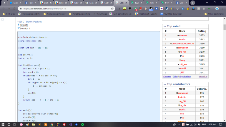
Doesn't seem right. I can't even read the main function yet (the I/O optimization doesn't make up anything of the solution, and the find() function above is obviously not the total solution).
And by my estimation, the full solution takes up 1.5 screens. For anyone that have solved 1066D - Boxes Packing, the model solution can't be that tremendously long right?
So I copy-pasted the solution and submitted it to some random problem (I don't want to get another AC, just to test the source code representation). And this is what I have (submission link here):
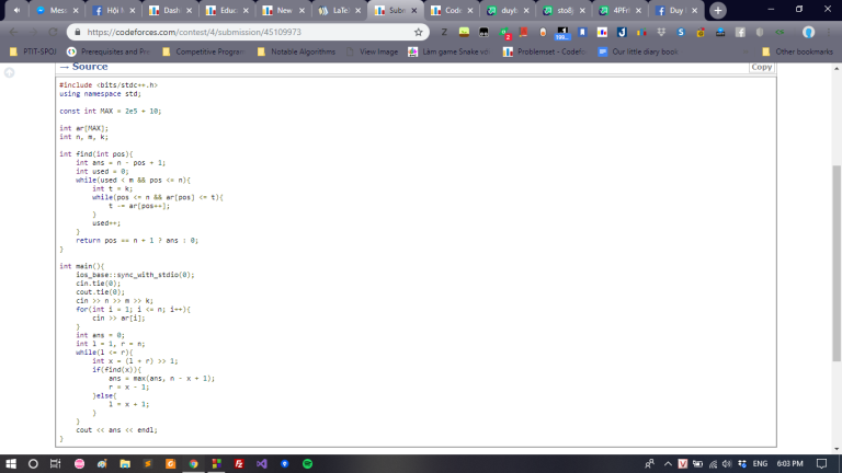
It fits in just right. Difference in the very same platform.
Let's take another example. The target is the editorial blog post of Educational Codeforces Round 53 — to be specific, problem G and its model solution by adedalic.
And I have this:
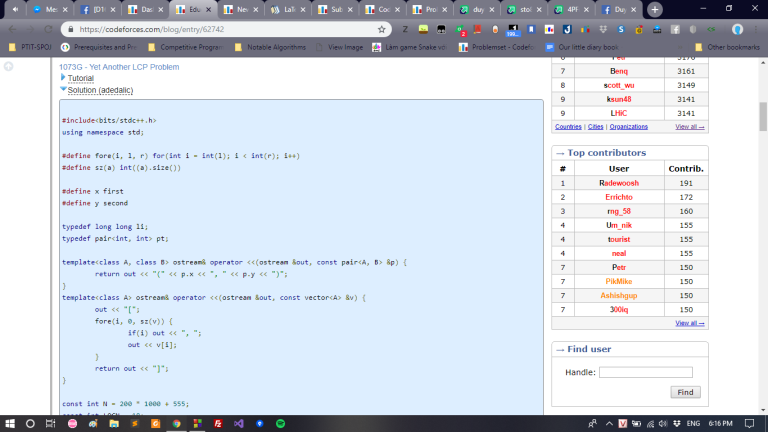
Oh great. Now I can't even read anything further than macros and constant declarations.
To be honest, this one is a long solution indeed (compared to model solutions for casual problems). Let's diagnose deeper.
I copied the source code into my IDE. The source code is 175 lines long, and a screen in my IDE can show 39 lines:
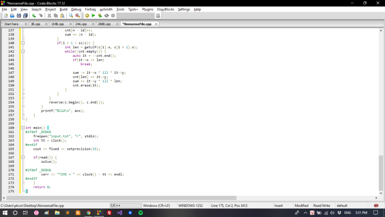
Preview it in Codeforces' submission page result in this (the link is here):
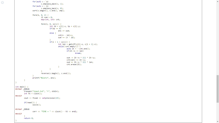
54 lines of source code visible. Technically it's similar to my IDE, just the full screen makes the result better a bit.
And in the blog post:
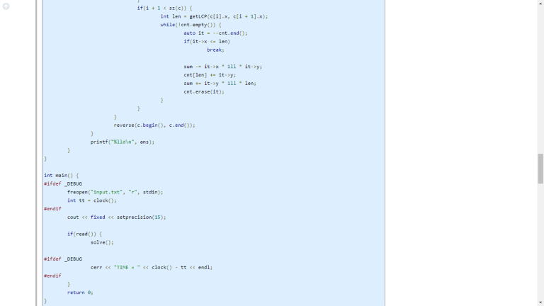
36 lines. 33.33% fewer than the submission pages. The rate is incredibly high.
Then what causes such differences?
Looking into the two screenshots again, we can see two points:
- The font size in the blog post is slightly bigger than in the submission pages. This one might be neglected in some extents, since smaller fonts might affect people with low visibility. Still, if the submission pages work right, then why can't the blog post be the same?
- This one is much more significant. The line spacings in the blog post is way wider and unnecessary. In the submission pages, the line spacing's width is from about
 to
to  that of the line itself, while it's about
  the size in the blog posts.
Why am I complaining about this? How could the codes being presented in more spaces discourage people from reading it?
Let's make it simple. The model solution, hence its name, is something people would look at, not just to learn about the algorithms for the problem, but also coding experience from the problem setter himself/herself.
Let's assume every setter has for oneself model solutions which are nice, short and clean (as far as he/she can achieves). The short quality is ruined critically by the formatting. Imagine it, the source code is made one-third longer than usual, causing the hallucinogenic effect that makes people more prone to give up reading (since we all naturally feel tired within ourselves to read something long, at some extents depending on each individual). Therefore, the effect and purpose of publishing the source code is halved, and of course, the good efforts created by the setters are poorly wasted.
A solution for this issue can be simple. As I might have stated implicitly throughout the post, there exists two types of formatting source codes, one is worse in terms of UX than another — so why can't we replace it with the better one?
These are my analysis and opinions. I hope the administrators/moderators of the platform will look into this and provide some solutions to improve the satisfaction for both the users and the setters/solution writers.
Best regards.


