Hello, Codeforces community!
Before going into the details, I would like to give a huge thanks to the community for the interest and support. I'm really awestruck to see over a thousand user handles having been entered in the web app in just barely 30 hours. (At the time of writing this blog.) If you haven't gone through the previous blog, here it is.

There were some issues when I first made it live. I am sorry for that. I am no expert in the backend, so you guys had to face a lot of initial downtimes. Although I've applied a temporary fix, there's still work to be done. Keeping that aside, I would like to thank inputs from manish_joshi, arthurg, RestingRajarshi, -is-this-fft- and everyone who checked it out and gave their reviews. I have made some tweaks based on that and there's more to do.
Okay, so regarding how problems are categorized,
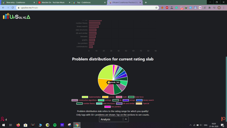
Step 1: While parsing the problem set, I put them in slabs according to their ratings. <1200, 1200-1600, 1600-1900, 1900-2100, 2100-2400 and >2400. The reasoning behind this is that as per my experience, I found people getting stuck often in these belts for long durations before their rating spikes up to the next block. This also helps determine which problem tags are more common and more useful to be practiced.
Step 2: We get the max rating of the user and according to that, all future calculations are done. The idea was plain and simple that the higher we reach, the harder we need to practice for a positive delta. Even if your rating falls, you should aim for a higher rating.
Step 3: All the previous submissions are analyzed and a solvability score is calculated which denotes that the user is most likely to be able to solve problems with that many AC submissions. The calculation is simple as well. Solvability = summation of (solved count * problem rating)/4000 for each AC submission. The constant 4000 comes from the fact that the highest-rated problems are of R3500.
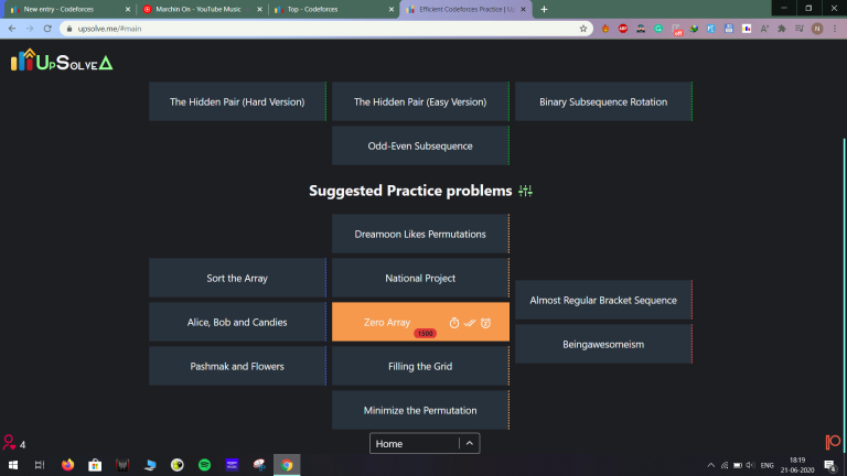
Step 4: The problem set is scanned to get suggestions on the basis of the following with priority ratio 1:2:3
The absolute difference of a problem's rating from the user's max-rating.
The problem tags are compared with the slab's sorted tag list (more problems of a tag => solving a problem of that tag would be more beneficial) and a tag score is calculated.
The ratio of the solved count of that problem to the highest solved problem in the range suitable for the user.
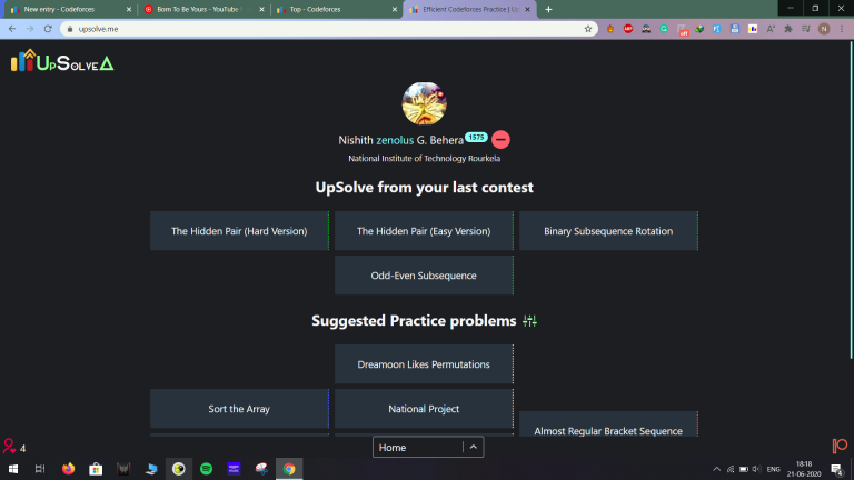
The section "UpSolve from last contest" doesn't see any of the above. However, the newly added "Recommended upsolves from past contests" section, based on this suggestion, undergoes the above processing.
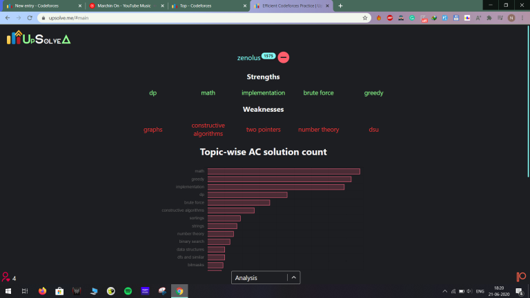
The analysis section is rather simple. It follows similar processing, though not this vivid. However, the catch is that in order to determine strengths and weaknesses, all submissions except those that are SKIPPED by the online judge are taken into consideration. An AC gives you a +1 for that tag but again, any other verdict gives you a -0.2 relatively.
Anyone interested can check out the complete project on my GitHub profile — ReactJS Frontend and MongoDB-ExpressJS-NodeJS Backend. I'm sorry for the messy code. I am still a complete newbie who wants to get into web dev.
Regarding updates, here I have some.
As previously mentioned, I am working on Team practice mode and tag whitelisting and blacklisting.
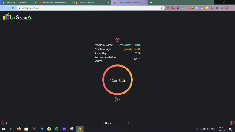
Secondly, I have a new idea in my mind to make the analysis part more useable. We have a stopwatch for everyone to see how much time they take to solve a problem. How about storing that data to make an analysis of how much time you have taken to solve the problem of a certain rating over the last 5-10 problems of the same rating? For example, the times taken to solve 5 of R1500 problems were 15min, 25min, 20min, 30min, and 20min. You don't need to keep track of that. In the analysis section, there would be a combined graph of problem ratings vs last 5-10 times taken. I think it can help analyze what kinda problems one faces more difficulty/takes more time in solving.
Lastly, as -is-this-fft- said in the last post, there may be quite some portion of people who prefer a simple motherfuckingwebsite.com format over a fancy UI. I was thinking, why not? I can retain all the functionality and make a side page plain and simple for such people to use.
Let me know your thoughts/suggestions in the comments. Thanks.


