


Recently, I was looking at some CF profiles in my friend list to guess how they practiced to reach their peak. As I have the rating-based heatmap extension installed, I noticed a common pattern: whenever someone reaches their peak or grows fast, there are a lot of orange to red colors around those days—even if they are currently cyan, blue, or purple.
I found it interesting because I often heard that solving $$$+200$$$ to $$$+300$$$ above your rating is the sweet spot for improvement. So I decided to analyze more data and visualize it to understand how solving hard problems affect rating growth. I came up with the idea to build a browser extension that plots your rating curve alongside a scatter plot of daily maximum solve difficulties, using rating-based color. I vibe coded this over a couple of hours, and here is the result on tourist's profile:
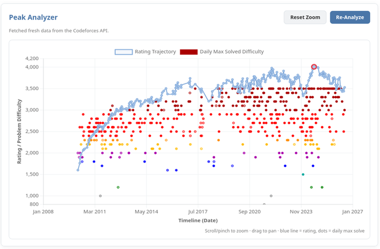
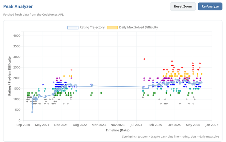
As I analyzed more profiles, I found out most users solved $$$+600$$$ to $$$+800$$$ difficulty problems in huge amounts right before or during their peak rating spikes. Of course, there are some exceptions who didn't solve many hard problems on CF, but most of them had prior olympiad backgrounds or problem solving experience elsewhere.
Anyway, you can check it out yourself here:
Links & Installation
- Firefox: Mozilla Add-ons Store
- Source Code: GitHub Repository
- Chrome/Brave: Installation Guide & ZIP Releases


Orz
Hail CrazyCoder00 sama